Geographic Mapping from a CSV File Using Python and Basemap
Python's Basemap library is a powerful tool used to transform and visualize geographic data similar to that of ArcGIS or QGIS. The Basemap library unites the versatility of Python with the cartographic capabilities of mapping and projection used by earth scientists, health professionals, and even local governments. Geographic information systems (GIS) can be used to analyze data based on location and give users the ability to visualize statistics that may depend on geography and may be otherwise ambiguous to other methods of analysis.
In this tutorial I will be exploring different data that include latitude and longitude points to analyze their geographic variability using visual tools available in Python. All of the data used is open and available to the public, which should allow replication of the methods shown here.
Simple Plot Using Basemap
The Python Basemap example gallery (here) is a fantastic resource for learning how to plot GIS data in Python. I have used their tutorials in the past and will be using their methods for some of the content that follows. First, I want to create a simple example to test whether the Basemap toolkit is working. To start, define a coordinate of interest (if you're not sure what coordinates to use, go to http://en.mygeoposition.com/ and type in any zip code or address and use the latitude and longitude coordinates it returns), then input the latitude and longitude values into the code below. This will take the coordinate, create a bounding box surrounding it, and plot it onto a map. If your map is not visible, try zooming out by increasing the parameter 'zoom_scale.'
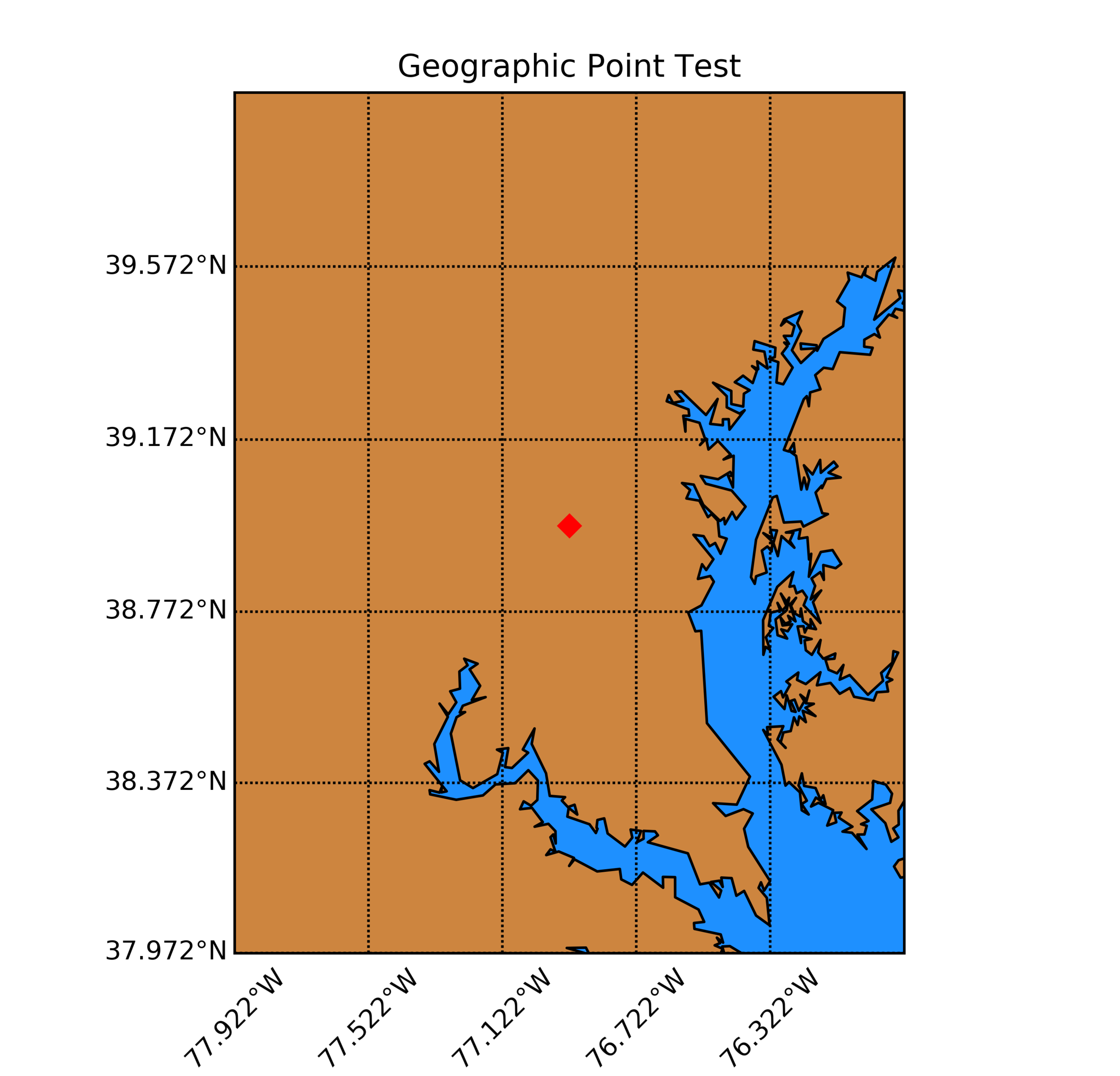
Figure 1: Example Mapping of Geographic Point
If you were not able to produce the plot above on your end, it's likely that there is an error with Python and the installation of libraries. The Basemap library requires many other libraries, so be sure that any errors associated with libraries is handled before advancing.
NOTICE:
There is an error that may appear regarding an 'axesPatch' due to deprecation - as of writing (July 2018) there isn't any obvious fix, but it doesn't seem to affect any plots. If it becomes a serious issue in the future, an update will likely solve it.Mapping CSV Data: Automated Surface Observing System (ASOS) Stations
The Automated Surface Observing System (ASOS) was designed for meteorological and aviation needs regarding safety and weather prediction for the general public across the United States. The stations are often used to generate much of the weather data produced by apps and news organizations, and therefore, mapping them can be very informative for companies interested in generating such applications.
In the example below, I'm using the ASOS station file found here. I've reformatted it to be read easily using Python's 'csv' library. The .csv formatted file can be found here. Download the file and make sure it is named 'asos_stations.csv' - which should be the default name. Ensure that it is saved in the same folder as the project and code used in this tutorial. After downloading the file, run the csv point plotter code below and verify that it has plotted the hundreds of points onto the world map.
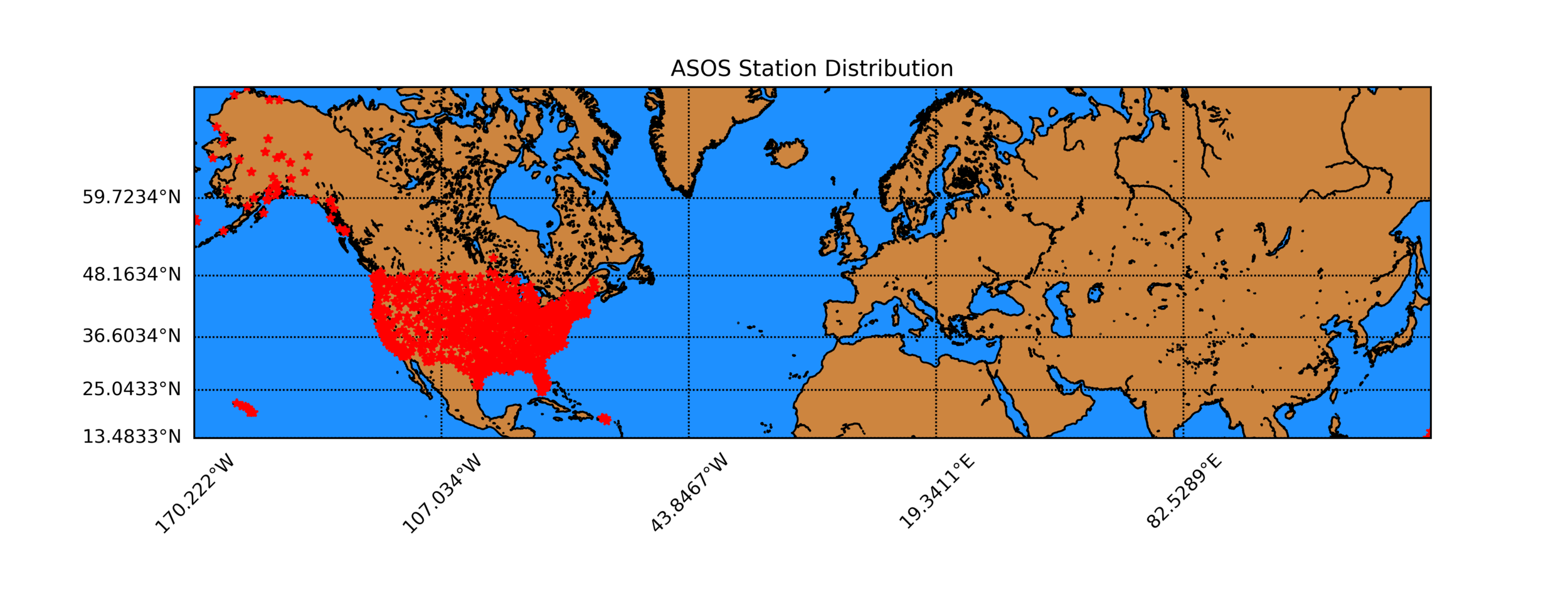
Figure 2: Distribution of ASOS stations in the U.S. and its territories. Because of the projection, the entire width of the world is plotted due to the inclusion of Alaska's Archipelago. This can be clipped by limiting the bounds of the map.
If we only take the data between UTC -5 and UTC -8 (continental U.S.), we can get a cleaner plot that really shows the distribution of ASOS stations:

Figure 3: ASOS stations filtered by UTC -5 to UTC -8 to view the distribution of stations in the continental U.S.
Mapping Interesting Data
Now that we've created a routine that can read .csv files and plot geographic points, let's create some interesting visualizations that we can manipulate to tell a story. In the case below, I'm still using the ASOS station .csv file, but now I'm incorporating the elevation into the colormap to give the points a color-coded distribution.
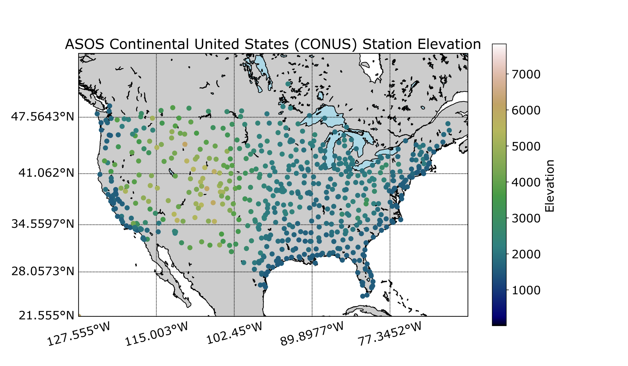
If one were to look at an elevation map of the United States, they would find a similar profile to the one above, demonstrating the ridges and contours of elevation throughout the mountainous parts of the country.
Conclusion
This tutorial demonstrated the power of Python's Basemap toolkit and the use of publicly available data to map geographic data. One can see the power of this tool through applications in weather, geography, aviation, and even health services. It is easy to assemble data in geographic formats, and tools available in Python make that data easy to work with through its capable toolboxes and libraries specifically designed for GIS applications. The possibilities are endless, and I could extend this project for pages, however, I will leave further elaboration until next time and end with a few excellent resources on the topic of Python's Basemap toolbox and GIS applications:
See More in Programming and GIS: