Visualizing COVID-19 Data in Python
A lot of data surrounding COVID-19 cases are scattered throughout the web, along with various visualizations and figures. This blog post is aimed at creating meaningful visualizations that may or may not be available elsewhere, while instructing users on how to source, analyze, and visualize COVID-19 infection case and rate data using Python. All of the data used herein is publicly available for anyone interested in replicating the figures, with code and links where necessary. The methods used here have been uniquely conceived and developed by Maker Portal, and in no way reflect preferred methods of either the government or any other private entities. Several Python toolboxes will be implemented below, and it is recommended that users install and verify their functionality before attempting to replicate the forthcoming figures. The visualizations below were computed at a static period in time, and thus, will have a timestamp of the date when the data was retrieved. There is also a Github repository of codes and high-resolution figures at https://github.com/makerportal/COVID19-visualizations.
Python’s “requests” library will be used to scrape data from Github, using their raw user content repository format. Using requests, we can 'get' data from .csv files using the following simple method:
#######################################
# Scraping public data from Github
#######################################
#
#
import requests

# COVID-19 Datasets
github_url = 'https://raw.githubusercontent.com/nychealth/coronavirus-data/master/' # nyc data repository
data_file_urls = ['boro.csv','by-age.csv','by-sex.csv','case-hosp-death.csv',
                  'summary.csv','tests-by-zcta.csv'] # the .csv files to read where data exists

# read borough data file first and plot
r = requests.get(github_url+data_file_urls[0])
txt = r.content.decode('utf-8-sig').split('\r\n') # this vector contains all the data
header = txt[0].split(',')
Looking at the variables 'txt' we can see that it houses all the data from New York City’s Coronavirus (COVID-19) data repository for each of its 5 boroughs, housed publicly on Github. The 'header' variable, if printed out, shows the data headers for the .csv file selected. If we were to change the index of the 'data_file_url' variable to 1, then we would scrape the 'by-age.csv' data instead of the 'boro.csv' data, and so on. What will be done going forward is parsing and plotting of data. The format given above is the foundation of acquiring the data, and going forward, the plotting and programming will become increasingly more complex.
The data used here is acquired from the NYC Health Department, with no adaptations whatsoever:
For a breakdown of the data and variables, see the NYC COVID-19 Github repository:
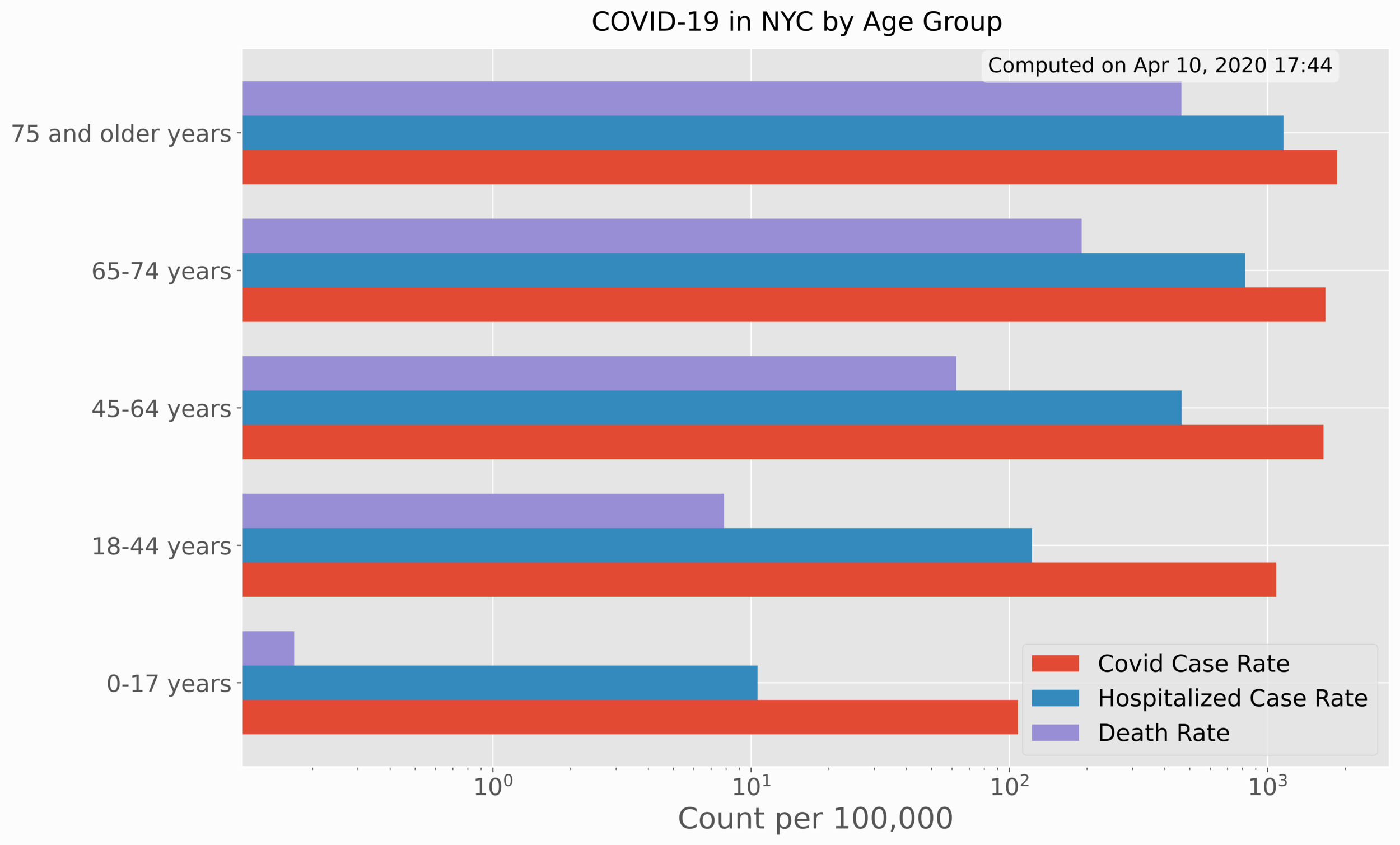
The first set of data analyzed involves cases, hospitalizations, and deaths by age and sex.
This section involves visualization of age/sex data based on COVID-19 rates of confirmed cases, hospitalizations, and deaths. The use of Python bar charts will help us compare each of the rates by sex and age group. The age group visualization is given below:
The code to replicate the age rate bar chart is also given below:
################################
# Mapping NYC COVID-19 Age Data
################################
#
#
import numpy as np
import matplotlib.pyplot as plt
import requests,datetime,os

plt.style.use('ggplot') # ggplot formatting

# COVID-19 Datasets
github_url = 'https://raw.githubusercontent.com/nychealth/coronavirus-data/master/' # nyc data repository
data_file_urls = ['boro.csv','by-age.csv','by-sex.csv','case-hosp-death.csv',
                  'summary.csv','tests-by-zcta.csv'] # the .csv files to read where data exists

# read borough data file first and plot
r = requests.get(github_url+data_file_urls[1])
txt = r.content.decode('utf-8-sig').split('\r\n') # this vector contains all the data
header = txt[0].split(',')

fig,ax = plt.subplots(figsize=(14,9))
spacer = -0.25
for plot_indx in range(1,len(header)):
    data_to_plot,x_range = [],[]
    for jj in range(1,len(txt)-1):
        x_range.append(txt[jj].split(',')[0])
        data_to_plot.append(float(txt[jj].split(',')[plot_indx]))
    x_plot = np.arange(0,len(x_range))+spacer
    hist = ax.barh(x_plot,data_to_plot,label=header[plot_indx].replace('_',' ').title(),height=0.25,log=True)
    spacer+=0.25

ax.set_xlabel('Count per 100,000',fontsize=20)
ax.set_yticks(np.arange(0,len(x_range)))
ax.set_yticklabels(x_range)
ax.legend(fontsize=16)
ax.tick_params('both',labelsize=16)
fig.suptitle('COVID-19 in NYC by '+header[0].replace('_',' ').title(),y=0.92,fontsize=18)
# textbox showing the date the data was processed
txtbox = ax.text(0.0, 0.975, 'Computed on '+datetime.datetime.now().strftime('%b %d, %Y %H:%M'), transform=ax.transAxes, fontsize=14,
        verticalalignment='center', bbox=dict(boxstyle='round', facecolor='w',alpha=0.5))
txtbox.set_x(1.0-(txtbox.figure.bbox.bounds[2]-(txtbox.clipbox.bounds[2]-txtbox.clipbox.bounds[0]))/txtbox.figure.bbox.bounds[2])
fig.savefig(header[0]+'_in_nyc.png',dpi=300,facecolor='#FCFCFC',bbox_inches = 'tight')
It is easy to see that there is a sharp dependence on age with respect to each of the case rates, hospitalization rates, and death rates.
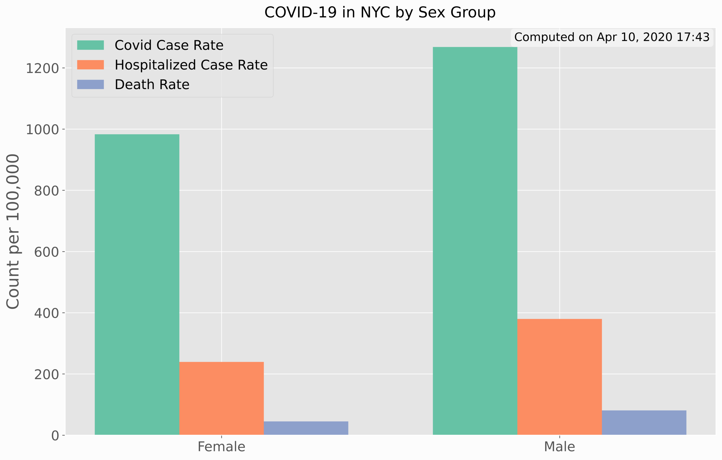
In Python, the horizontal bar chart is used. The rates by sex can be plotted almost exactly the same, as shown below:
For the case of rates by sex, the vertical bar chart proved to be better for visualization.
The code to replicate this plot is also given below:
################################
# Mapping NYC COVID-19 Sex Data
################################
#
#
import numpy as np
import matplotlib.pyplot as plt
import requests,datetime,os

plt.style.use('ggplot') # ggplot formatting

# COVID-19 Datasets
github_url = 'https://raw.githubusercontent.com/nychealth/coronavirus-data/master/' # nyc data repository
data_file_urls = ['boro.csv','by-age.csv','by-sex.csv','case-hosp-death.csv',
                  'summary.csv','tests-by-zcta.csv'] # the .csv files to read where data exists

# read borough data file first and plot
r = requests.get(github_url+data_file_urls[2])
txt = r.content.decode('utf-8-sig').split('\r\n') # this vector contains all the data
header = txt[0].split(',')

fig,ax = plt.subplots(figsize=(14,9))
spacer = -0.25
cii = 0
for plot_indx in range(1,len(header)):
    data_to_plot,x_range = [],[]
    for jj in range(1,len(txt)-1):
        x_range.append(txt[jj].split(',')[0])
        data_to_plot.append(float(txt[jj].split(',')[plot_indx]))
    x_plot = np.arange(0,len(x_range))+spacer
    hist = ax.bar(x_plot,data_to_plot,label=header[plot_indx].replace('_',' ').title(),width=0.25,color=plt.cm.Set2(cii))
    spacer+=0.25
    cii+=1

ax.set_ylabel('Count per 100,000',fontsize=20)
ax.set_xticks(np.arange(0,len(x_range)))
ax.set_xticklabels(x_range)
ax.legend(fontsize=16)
ax.tick_params('both',labelsize=16)
fig.suptitle('COVID-19 in NYC by '+header[0].replace('_',' ').title(),y=0.92,fontsize=18)
# textbox showing the date the data was processed
txtbox = ax.text(0.0, 0.975, 'Computed on '+datetime.datetime.now().strftime('%b %d, %Y %H:%M'), transform=ax.transAxes, fontsize=14,
        verticalalignment='center', bbox=dict(boxstyle='round', facecolor='w',alpha=0.5))
txtbox.set_x(1.04-(txtbox.figure.bbox.bounds[2]-(txtbox.clipbox.bounds[2]-txtbox.clipbox.bounds[0]))/txtbox.figure.bbox.bounds[2])
fig.savefig(header[0]+'_in_nyc.png',dpi=300,facecolor='#FCFCFC',bbox_inches = 'tight')
Again, there is a clear distinction between rates and sex, leaning heavier on males rather than women. This indicates that men have higher rates of infection, higher hospitalization rates, and higher death rates. In the next section, we will see how cases have evolved over time for COVID-19.
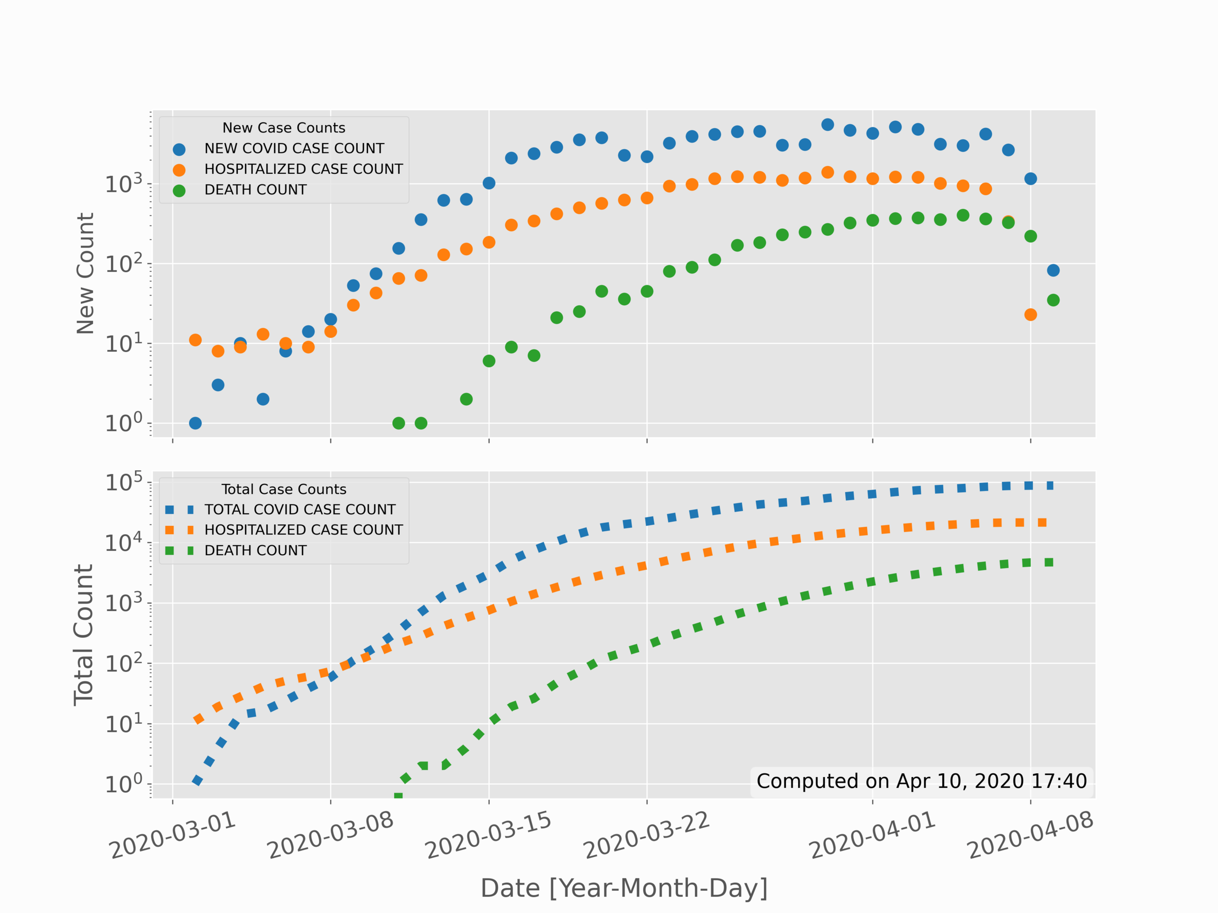
In the previous section, data was partitioned based on distinct factors: sex and age group. In this section, the partitioning will shift to time. This allows us to see possible trends in data over time, as well as make comparisons with models or projections. The simple time series for new positive cases, new hospitalizations, and new deaths is given in the top subplot below; while the sum of total cases, hospitalizations, and deaths is given in the bottom subplot below:
This visualization is slightly more complicated than the previous two, as it requires some date conversions and mathematics. The code is given below, followed by a description of the methods:
##########################################
# Mapping NYC COVID-19 Time Series Data
##########################################
#
#
import numpy as np
import matplotlib.pyplot as plt
import requests,datetime,os

plt.style.use('ggplot') # ggplot formatting

# COVID-19 Datasets
github_url = 'https://raw.githubusercontent.com/nychealth/coronavirus-data/master/' # nyc data repository
data_file_urls = ['boro.csv','by-age.csv','by-sex.csv','case-hosp-death.csv',
                  'summary.csv','tests-by-zcta.csv'] # the .csv files to read where data exists

# read borough data file first and plot
r = requests.get(github_url+data_file_urls[3])
txt = r.content.decode('utf-8-sig').split('\r\n') # this vector contains all the data

header = txt[0].split(',')
dates = [datetime.datetime.strptime(ii.split(',')[0],'%m/%d/%y') for ii in txt[1:]]

fig,axs = plt.subplots(2,1,figsize=(12,9))
cii = 0
for jj in range(1,len(txt[0].split(','))):
    vals = []
    for ii in range(0,len(txt[1:])):
        val = (txt[1:])[ii].split(',')[jj]
        if val=='':
            val = np.nan
        else:
            val = float(val)
        vals.append(val)

    axs[0].scatter(dates,vals,label=txt[0].split(',')[jj].replace('_',' '),color=plt.cm.tab10(cii),linewidth=3.0)
    axs[1].plot(dates,np.nancumsum(vals),label=(txt[0].split(',')[jj]).replace('_',' ').replace('NEW','TOTAL'),
                                                                linewidth=6.0,color=plt.cm.tab10(cii),linestyle=':')
    cii+=1

axs[0].legend(title='New Case Counts')
axs[0].tick_params(axis='x', rotation=15)
axs[0].set_ylabel('New Count',fontsize=16)
axs[0].set_yscale('log')
axs[0].tick_params('both',labelsize=16)
axs[0].set_xticklabels([])
axs[1].legend(title='Total Case Counts')
axs[1].set_yscale('log')
axs[1].tick_params(axis='x', rotation=15)
axs[1].set_xlabel('Date [Year-Month-Day]',fontsize=18,labelpad=10)
axs[1].set_ylabel('Total Count',fontsize=18)
axs[1].tick_params('both',labelsize=16)
fig.subplots_adjust(hspace=0.1)
fig.savefig(header[0]+'_in_NYC_COVID19.png',dpi=300,facecolor='#FCFCFC')
In the code above, much remains the same in the first few lines - particularly with respect to scraping and parsing data. The first divergence occurs when we convert the times into what is called a 'datetime' variable in Python. This datetime variable handles much of the time-series methods such as formatting dates and handling years, months, and days.
Next, the new cases, hospitalization, and death rates were plotted raw on the first subplot, while on the second subplot the values needed to be added cumulatively (hence the 'np.cumsum()' function. Lastly, the values were plotted and formatted using a logarithmic y-axis, which is presented as seen in the plot above. In the next section, we’ll move from simple 2-D variables to more complex 3-D variables, which use spatial indexing to map data with geographic coordinates.
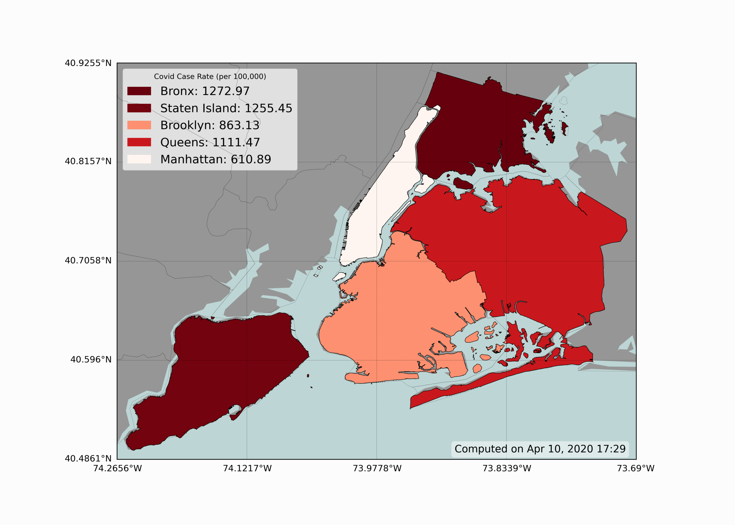
Visualizing geographic information is one of the most useful tools in epidemiology - as it can give scientists an idea of how specific areas are affected and what generalizations they can make regarding specific regions. Below is a simple geographic visualization of New York City, showing how each borough of NYC is affected by COVID-19:
We can see from the figure above that The Bronx and Staten Island seem to have the highest case rate of the five boroughs. Conversely, Manhattan, the borough with the highest population density, seems to have the lowest rate of infection of COVID-19.
In Python, the basemap toolkit is used to produce the geographic visualization shown above. The coloration of each borough also uses a colormap, defined as a range of reds, where less red indicates less severity, and deeper red indicates more severity in infection rate. Below is the code used to replicate the figure above:
#######################################
# Mapping NYC COVID-19 Borough Data
#######################################
#
#
import numpy as np
import matplotlib.pyplot as plt
import requests,datetime,os
from mpl_toolkits.basemap import Basemap
from matplotlib.patches import Polygon
from matplotlib.collections import PatchCollection
from osgeo import ogr

plt.style.use('ggplot') # ggplot formatting

def basemapper(): #geographic plotting routine
    fig,ax = plt.subplots(figsize=(14,10))
    m = Basemap(llcrnrlon=bbox[0],llcrnrlat=bbox[1],urcrnrlon=bbox[2],
               urcrnrlat=bbox[3],resolution='h', projection='cyl') # cylindrical projection ('merc' also works here)
    shpe = m.readshapefile(shapefile.replace('.shp',''),'curr_shapefile')
    m.drawmapboundary(fill_color='#bdd5d5') # map color
    m.fillcontinents(color=plt.cm.tab20c(17)) # continent color
    m.drawcounties(color='k',zorder=999)
    parallels = np.linspace(bbox[1],bbox[3],5) # latitudes
    m.drawparallels(parallels,labels=[True,False,False,False],fontsize=12,linewidth=0.25)
    meridians = np.linspace(bbox[0],bbox[2],5) # longitudes
    m.drawmeridians(meridians,labels=[False,False,False,True],fontsize=12,linewidth=0.25)
    return fig,ax,m

# COVID-19 Datasets
github_url = 'https://raw.githubusercontent.com/nychealth/coronavirus-data/master/' # nyc data repository
data_file_urls = ['boro.csv','by-age.csv','by-sex.csv','case-hosp-death.csv',
                  'summary.csv','tests-by-zcta.csv'] # the .csv files to read where data exists

# shapefiles and geographic information
# nyc borough shapefile: https://data.cityofnewyork.us/api/geospatial/tqmj-j8zm?method=export&format=Shapefile
shapefile_folder = './Borough Boundaries/' # location of city shapefile (locally)
shapefile = shapefile_folder+os.listdir(shapefile_folder)[0].split('.')[0]+'.shp'
drv    = ogr.GetDriverByName('ESRI Shapefile') # define shapefile driver
ds_in  = drv.Open(shapefile,0) # open shapefile
lyr_in = ds_in.GetLayer() # grab layer
shp = lyr_in.GetExtent() # shapefile boundary
zoom = 0.01 # zooming out or in of the shapefile bounds
bbox = [shp[0]-zoom,shp[2]-zoom,shp[1]+zoom,shp[3]+zoom] # bounding box for plotting
fig,ax,m = basemapper() #handler for plotting geographic data

# read borough data file first and plot
r = requests.get(github_url+data_file_urls[0])
txt = r.content.decode('utf-8-sig').split('\r\n') # this vector contains all the data
header = txt[0].split(',')

header_to_plot = 2 # 2 = case rate per 100,000, 1 = case count

boroughs = np.unique([ii['boro_name'] for ii in m.curr_shapefile_info]) # borough vector from shapefile
boro_data,counts,rates = {},[],[]
for ii,boro in zip(range(1,len(txt)-1),boroughs):
    curr_data = txt[ii].split(',')
    if boro.lower()==((curr_data[0]).lower()).replace('the ',''): # matching borough to data
        print(txt[ii].split(',')[0]+' - {0}: {1:2.0f}, {2}: {3:2.2f}'.\
              format(header[1],float(curr_data[1]),header[2],float(curr_data[2])))
        boro_data[boro.lower()+'_'+header[1]] = float(curr_data[1])
        boro_data[boro.lower()+'_'+header[2]] = float(curr_data[2])
        counts.append(float(curr_data[1]))
        rates.append(float(curr_data[2]))

data_array = [counts,rates]
legend_str = ['',' (per 100,000)']
patches,patch_colors,patches_for_legend = [],{},[] # for coloring boroughs
for info, shape in zip(m.curr_shapefile_info, m.curr_shapefile):
    if info['boro_name'] in patch_colors.keys():
        pass
    else:
        patch_colors[info['boro_name']] = plt.cm.Reds(np.interp(boro_data[info['boro_name'].lower()+'_'+header[header_to_plot]],
                                                                  [np.min(data_array[header_to_plot-1]),
                                                                   np.max(data_array[header_to_plot-1])],[0,1]))
        patches_for_legend.append(Polygon(np.array(shape), True, color=patch_colors[info['boro_name']],
                                          label=info['boro_name']+': '+str(boro_data[info['boro_name'].lower()+'_'+header[header_to_plot]])))

    patches.append(Polygon(np.array(shape), True, color=patch_colors[info['boro_name']])) # coloring the boroughs

pc = PatchCollection(patches, match_original=True, edgecolor='k', linewidths=1., zorder=2)
ax.add_collection(pc)
leg1 = ax.legend(handles=patches_for_legend,title=header[header_to_plot].replace('_',' ').\
          lower().title()+legend_str[header_to_plot-1],fontsize=16,framealpha=0.95)
# textbox showing the date the data was processed
txtbox = ax.text(0.0, 0.025, 'Computed on '+datetime.datetime.now().strftime('%b %d, %Y %H:%M'), transform=ax.transAxes, fontsize=14,
        verticalalignment='center', bbox=dict(boxstyle='round', facecolor='w',alpha=0.5))
txtbox.set_x(1.0-(txtbox.figure.bbox.bounds[2]-(txtbox.clipbox.bounds[2]-txtbox.clipbox.bounds[0]))/txtbox.figure.bbox.bounds[2])
fig.savefig(header[header_to_plot]+'_spatial_plot.png',dpi=300)
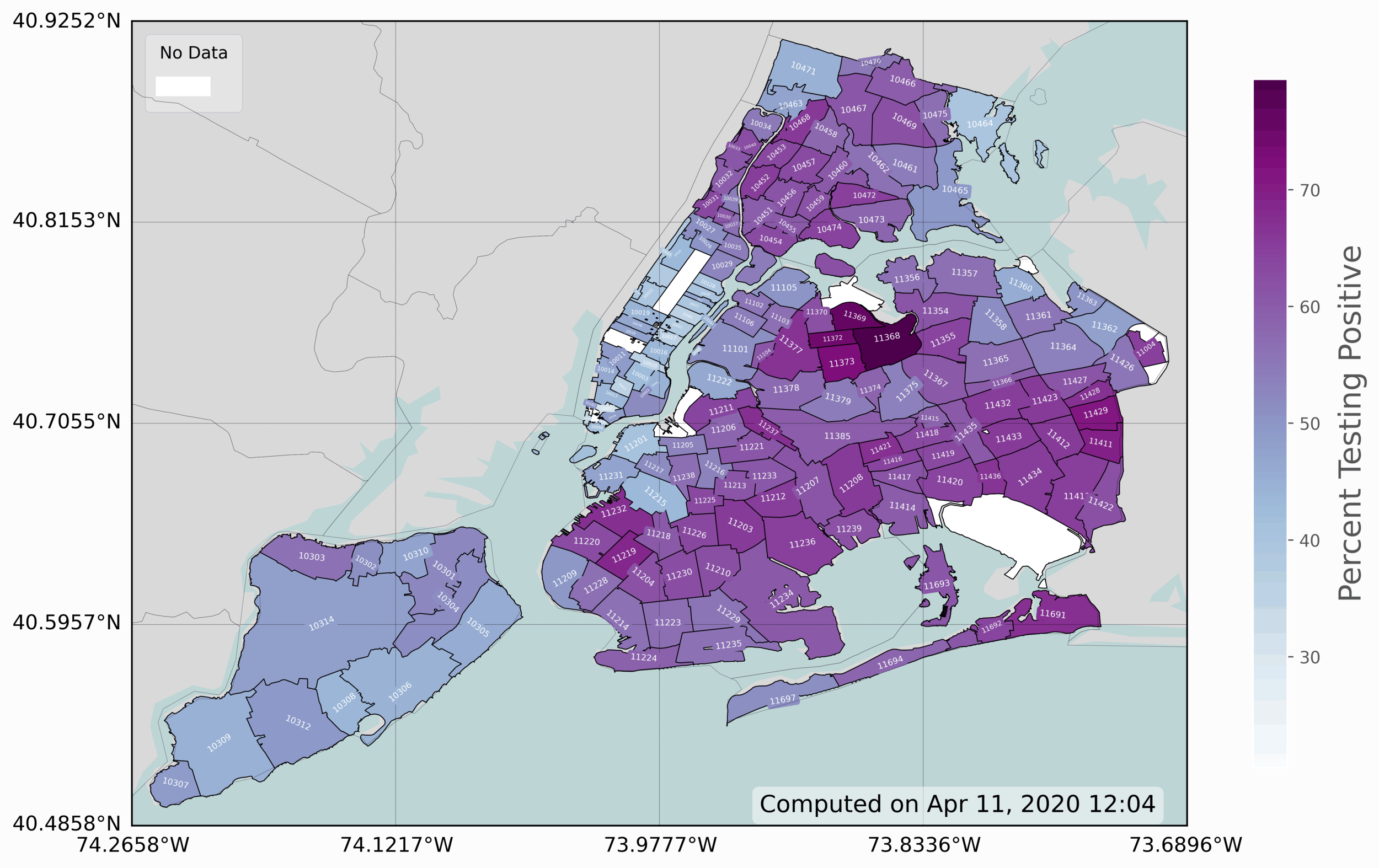
The last and final visualization presented is the zip code map infection rate of COVID-19 in New York City. This is the most advanced plot, as it requires some dynamic modification of coloring, labeling, and placing of data. This is a 3-D visualization, which includes 2-D geographic information and COVID-19 positive testing rates (colored in blue/purple).
The code to replicate this plot is again given below:
#######################################
# Mapping NYC COVID-19 Zip Code Data
#######################################
#
#
import numpy as np
import matplotlib.pyplot as plt
import requests,datetime,os
from mpl_toolkits.basemap import Basemap
from matplotlib.patches import Polygon
from matplotlib.collections import PatchCollection
from osgeo import ogr

plt.style.use('ggplot') # ggplot formatting

def basemapper(): #geographic plotting routine
    fig,ax = plt.subplots(figsize=(14,10))
    m = Basemap(llcrnrlon=bbox[0],llcrnrlat=bbox[1],urcrnrlon=bbox[2],
               urcrnrlat=bbox[3],resolution='h', projection='cyl') # cylindrical projection ('merc' also works here)
    shpe = m.readshapefile(shapefile.replace('.shp',''),'curr_shapefile')
    m.drawmapboundary(fill_color='#bdd5d5') # map color
    m.fillcontinents(color=plt.cm.tab20c(19)) # continent color
    m.drawcounties(color='k',zorder=999)
    parallels = np.linspace(bbox[1],bbox[3],5) # latitudes
    m.drawparallels(parallels,labels=[True,False,False,False],fontsize=12,linewidth=0.25)
    meridians = np.linspace(bbox[0],bbox[2],5) # longitudes
    m.drawmeridians(meridians,labels=[False,False,False,True],fontsize=12,linewidth=0.25)
    return fig,ax,m

# COVID-19 Datasets
github_url = 'https://raw.githubusercontent.com/nychealth/coronavirus-data/master/' # nyc data repository
data_file_urls = ['boro.csv','by-age.csv','by-sex.csv','case-hosp-death.csv',
                  'summary.csv','tests-by-zcta.csv'] # the .csv files to read where data exists

# shapefiles and geographic information
# nyc zip code shapefile: https://data.cityofnewyork.us/Business/Zip-Code-Boundaries/i8iw-xf4u
shapefile_folder = './ZIP_CODE_040114/' # location of city shapefile (locally)
shapefile = shapefile_folder+os.listdir(shapefile_folder)[0].split('_correct_CRS')[0]+'_correct_CRS.shp'
drv    = ogr.GetDriverByName('ESRI Shapefile') # define shapefile driver
ds_in  = drv.Open(shapefile,0) # open shapefile
lyr_in = ds_in.GetLayer() # grab layer
shp = lyr_in.GetExtent() # shapefile boundary
zoom = 0.01 # zooming out or in of the shapefile bounds
bbox = [shp[0]-zoom,shp[2]-zoom,shp[1]+zoom,shp[3]+zoom] # bounding box for plotting
fig,ax,m = basemapper() #handler for plotting geographic data

fig.canvas.draw() # draw to get transform data
transf = ax.transData.inverted() # for labeling
shape_areas = [ii['AREA'] for ii in m.curr_shapefile_info] # for shrinking text size in zip codes

# read borough data file first and plot
r = requests.get(github_url+data_file_urls[5]) # request the zipcode data
txt = r.content.decode('utf-8-sig').split('\r\n') # this vector contains all the data
header = txt[0].split(',') # get file header info

zipcodes = [data_row.split(',')[0] for data_row in txt[3:]] # zip codes
zipcode_pos = [float(data_row.split(',')[1]) for data_row in txt[3:]] # positive cases
zipcode_tot = [float(data_row.split(',')[2]) for data_row in txt[3:]] # total tested
zipcode_perc = [float(data_row.split(',')[3]) for data_row in txt[3:]] # percent (division of the two above * 100)

data_array = [zipcode_pos,zipcode_tot,zipcode_perc]
data_titles = ['Positive Cases','Total Tested','Percent Testing Positive']
data_indx = 2 # select which data to plot
data_range = [np.min(data_array[data_indx]),np.max(data_array[data_indx])] # for colormapping

# color schemes
cmap_sel = plt.cm.BuPu # selected colormap for visualizations
txt_color = 'w' # color of zipcode text
shape_edge_colors = 'k' # color of edges of shapes
NA_color = 'w' # color of zip codes without data

match_array,patches,patches_NA,color_array,txt_array = [],[],[],[],[]
for info,shape in zip(m.curr_shapefile_info,m.curr_shapefile):
    if info['POPULATION']==0.0: # if no population, color the shape white
        patches_NA.append(Polygon(np.array(shape), True, color=NA_color,label='')) # coloring the boroughs
        continue
    if info['ZIPCODE'] in zipcodes:
        # first find where the data matches with shapefile
        zip_indx = [ii for ii in range(0,len(zipcodes)) if info['ZIPCODE']==zipcodes[ii]][0]
        zip_data = data_array[data_indx][zip_indx]
        color_val = np.interp(zip_data,data_range,[0.0,1.0]) # data value mapped to unique color in colormap
        c_map = cmap_sel(color_val) # colormap to use

        if info['ZIPCODE'] in match_array:
            # check if we've already labelled this zip code (some repeat for islands, parks, etc.)
            patches.append(Polygon(np.array(shape), True, color=c_map))
        else:
            # this is the big data + annotation loop
            match_array.append(info['ZIPCODE'])
            patches.append(Polygon(np.array(shape), True, color=c_map)) # coloring the boroughs to colormap

            x_pts = [ii[0] for ii in shape] # get the x pts from the shapefile
            y_pts = [ii[1] for ii in shape] # get the y pts from the shapefile

            x_pts_centroid = [np.min(x_pts),np.min(x_pts),np.max(x_pts),np.max(x_pts)] # x-centroid for label
            y_pts_centroid = [np.min(y_pts),np.max(y_pts),np.min(y_pts),np.max(y_pts)] # y-centroid for label

            # calculate eigenvectors from covariance to get rough rotation of each zip code
            evals,evecs = np.linalg.eigh(np.cov(x_pts,y_pts))
            rot_vec = np.matmul(evecs.T,[x_pts,y_pts]) # multiply by inverse of cov matrix
            angle = (np.arctan(evecs[0][1]/evecs[0][0])*180.0)/np.pi # calculate angle using arctan
            angle-=90.0
            # make sure the rotation of the text isn't upside-down
            if angle<-90.0:
                angle+=180.0
            elif angle>90.0:
                angle-=180.0

            if angle<-45.0:
                angle+=90.0
            elif angle>45.0:
                angle-=90.0

            # this is the zipcode label, shrunken based on the area of the zip code shape
            txtbox = ax.text(np.mean(x_pts_centroid),np.mean(y_pts_centroid), info['ZIPCODE'], ha='center',
                              va = 'center',fontsize=np.interp(info['AREA'],np.sort(shape_areas)[::int(len(np.sort(shape_areas))/4.0)],
                                                               [1.0,2.0,4.0,5.0]),
                             rotation=angle, rotation_mode='anchor',color=txt_color,bbox=dict(boxstyle="round",ec=c_map,fc=c_map))

            # this bit ensures no labels overlap or obscure other labels
            trans_bounds = (txtbox.get_window_extent(renderer = fig.canvas.renderer)).transformed(transf)
            for tbox in txt_array:
                tbounds = (tbox.get_window_extent(renderer = fig.canvas.renderer)).transformed(transf)
                loops = 0
                while trans_bounds.contains(tbounds.x0,tbounds.y0) or trans_bounds.contains(tbounds.x1,tbounds.y1) or\
                        tbounds.contains(trans_bounds.x0,trans_bounds.y0) or tbounds.contains(trans_bounds.x1,trans_bounds.y1) or\
                trans_bounds.contains(tbounds.x0+((tbounds.x0+tbounds.x1)/2.0),tbounds.y0+((tbounds.y0+tbounds.y1)/2.0)) or \
                trans_bounds.contains(tbounds.x0-((tbounds.x0+tbounds.x1)/2.0),tbounds.y0-((tbounds.y0+tbounds.y1)/2.0)) or \
                trans_bounds.contains(tbounds.x0+((tbounds.x0+tbounds.x1)/2.0),tbounds.y0-((tbounds.y0+tbounds.y1)/2.0)) or\
                trans_bounds.contains(tbounds.x0-((tbounds.x0+tbounds.x1)/2.0),tbounds.y0+((tbounds.y0+tbounds.y1)/2.0)):
                    txtbox.set_size(txtbox.get_size()-1.0)
                    tbox.set_size(tbox.get_size()-1.0)
                    trans_bounds = (txtbox.get_window_extent(renderer = fig.canvas.renderer)).transformed(transf)
                    tbounds = (tbox.get_window_extent(renderer = fig.canvas.renderer)).transformed(transf)
                    loops+=1
                    if loops>10:
                        break

            txt_array.append(txtbox)
            if len(txt_array) % 10 == 0:
                print('{0:2.0f} % Finished'.format(100.0*(len(txt_array)/len(zipcodes))))

    else:
        patches_NA.append(Polygon(np.array(shape), True, color=NA_color,label='')) # coloring the shapes that don't have data white (parks, etc.)

# adding the shapes and labels to the figure
pc = PatchCollection(patches, match_original=True, edgecolor=shape_edge_colors, linewidths=1., zorder=2,cmap=cmap_sel)
pc_NA = PatchCollection(patches_NA, match_original=True, edgecolor=shape_edge_colors, linewidths=1., zorder=2)
ax.add_collection(pc)
ax.add_collection(pc_NA)

pc.set_clim(data_range) # set the colorbar bounds
cb = plt.colorbar(pc,shrink=0.75) # shrink the colorbar a little
cb.set_label(data_titles[data_indx],fontsize=18,labelpad=10) # set the label

leg1 = ax.legend(handles=[patches_NA[-1]],title='No Data',
                 fontsize=16,framealpha=0.95,loc='upper left') # add legend to describe NA-values

# textbox showing the date the data was processed
txtbox = ax.text(0.0, 0.025, 'Computed on '+datetime.datetime.now().strftime('%b %d, %Y %H:%M'), transform=ax.transAxes, fontsize=14,
        verticalalignment='center', bbox=dict(boxstyle='round', facecolor='w',alpha=0.5))
txtbox.set_x(1.1-(txtbox.figure.bbox.bounds[2]-(txtbox.clipbox.bounds[2]-txtbox.clipbox.bounds[0]))/txtbox.figure.bbox.bounds[2])
plt.show()
This last geographic visualization is perhaps the most interesting, in that it gives city officials an idea of where COVID-19 spreading and may give insight into why certain areas are affected and why others are not. The code to replicate this is somewhat similar to the previous, especially the borough map. However, there is some particular implementations that make this geographic plot more complex than the others. The first, is that we had to map the rates in order to get the full scale of the colormap to show best how the zip codes differ. Then, the zip codes had to be overlaid their respective boundaries - which was done by finding the center point of each shape and mapping the zip code labels to those points. The labels were also rotated based on the rough rotational axis of each shape. And finally, the font size of the labels had to be scaled in order to avoid overlap and also fit properly within the bounds of their respective zip code boundaries.
Some data sifting was also needed - as many of the zip codes in the NYC shapefile did not have data (the white spots). It is difficult to see all of the zip codes within Manhattan due to the limited resolution of the image available on this site, which is why a full-sized image was uploaded to this project’s Github page, and it is available for download there:
The Github contains much of the same information as is given here, but with higher resolution images, in case users want to use those instead of the compressed images on this site.
Countries and cities around the world produce millions of data points relating to health crises such as the COVID-19 pandemic. This is both beneficial and detrimental to the public’s relation to the severity of diseases and outbreaks - as much of the data is misconstrued or poorly understood. This is why, in this tutorial, we aimed to use this publicly available information and create several coding routines to produce meaningful visualizations of COVID-19 data. The data was acquired directly from New York City’s Department of Health, and was parsed directly into Python without any manipulation. Python has a multitude of powerful tools for analyzing and visualizing information, and several of those tools were used here. Bar charts were used to visualize less complex data, and indicated that age plays a major role in COVID-19 rates in NYC; the same was concluded for sex. Next, the time-series representation of NYC infections was plotted for both new cases and cumulative rates - indicating that over the range plotted (March - early April) the logarithmic slope of rates was plateauing. And finally, geographic maps were used to plot borough and zip code rates across New York City. This concludes the Python analysis of COVID-19 data and perhaps, if there is interest, another analysis will be conducted on a larger dataset.
See More in Python and Data Analysis: