Arduino Heart Rate Monitor Using MAX30102 and Pulse Oximetry
“As an Amazon Associates Program member, clicking on links may result in Maker Portal receiving a small commission that helps support future projects.”
Pulse oximetry monitors the oxygen saturation in blood by measuring the magnitude of reflected red and infrared light [read more about pulse oximetry here and here]. Pulse oximeteters can also approximate heart rate by analyzing the time series response of the reflected red and infrared light . The MAX30102 pulse oximeter is an Arduino-compatible and inexpensive sensor that permits calculation of heart rate using the method described above. In this tutorial, the MAX30102 sensor will be introduced along with several in-depth analyses of the red and infrared reflection data that will be used to calculate parameters such as heart rate and oxygen saturation in blood.
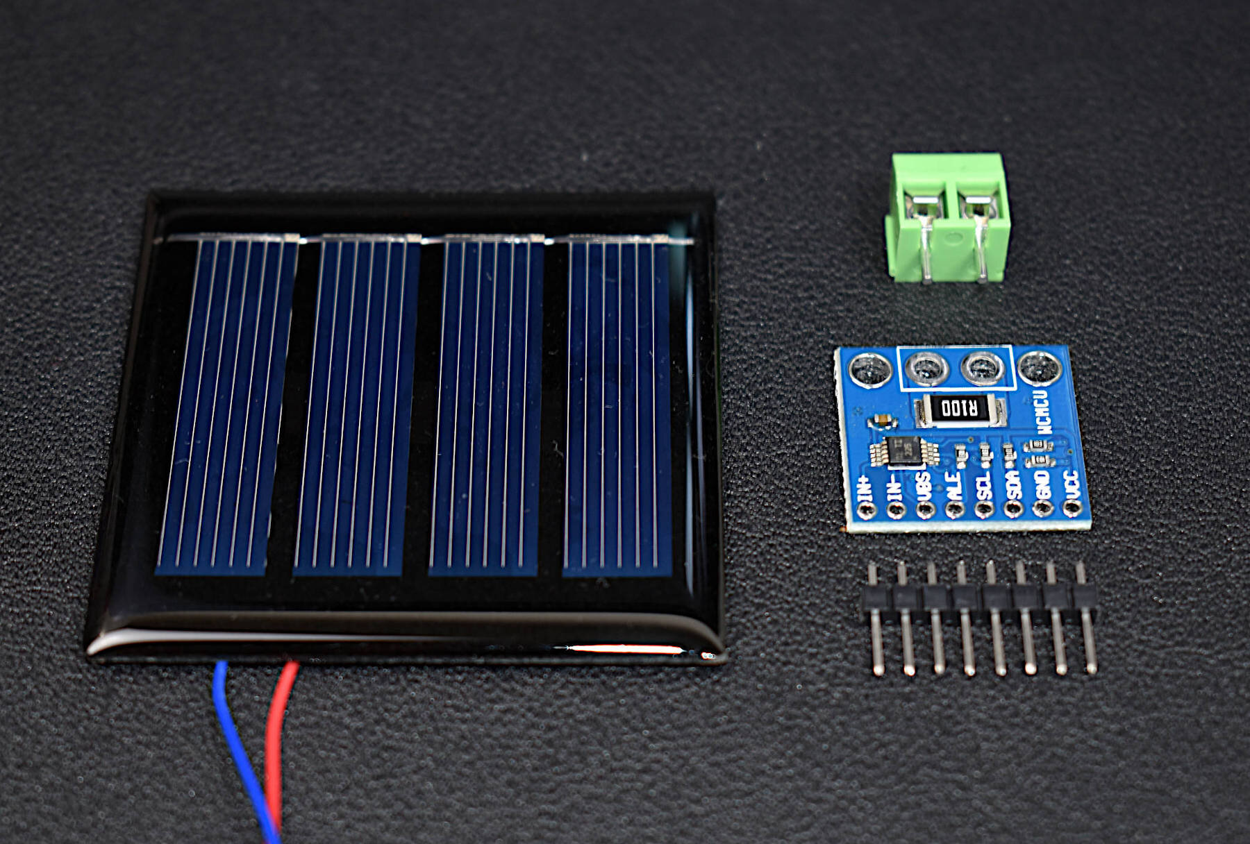
The primary components needed for this tutorial are the MAX30102 pulse oximeter and an Arduino microcontroller. I will also be using a Raspberry Pi to read high-speed serial data printed out by the Arduino. I’m using the Raspberry Pi because I will be analyzing the pulse data with robust Python programs and libraries that are not available on the Arduino platform. The parts list for the experiments is shown below:
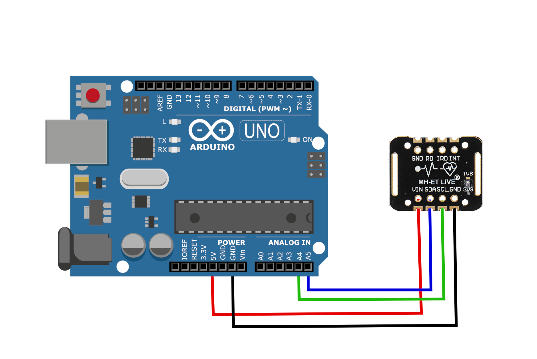
The MAX30102 uses two-wire I2C communication to interface with Arduino Uno board. I use the I2C ports on the A4/A5 ports on the Arduino board. The wiring is shown below:
Sparkfun has a library that handles the communication between Arduino and MAX30102. We will be using the Sparkfun library to handle high-speed readout of the red and IR reflectance data.
In the Arduino IDE:
Go to Sketch -> Include Library -> Manage Libraries
Type in “max30” into the search bar
Download the “Sparkfun MAX3010x Pulse and Proximity Sensor Library”

A simple high-speed setup based around the Arduino Uno is shown below. It samples the MAX30102 at 400 Hz and prints to the serial port. At 400 Hz and a serial baud rate of 115200, the Raspberry Pi is capable of reading each data point without issues.
#include <Wire.h>
#include "MAX30105.h"

MAX30105 particleSensor; // initialize MAX30102 with I2C

void setup()
{
  Serial.begin(115200);
  while(!Serial); //We must wait for Teensy to come online
  delay(100);
  Serial.println("");
  Serial.println("MAX30102");
  Serial.println("");
  delay(100);
  // Initialize sensor
  if (particleSensor.begin(Wire, I2C_SPEED_FAST) == false) //Use default I2C port, 400kHz speed
  {
    Serial.println("MAX30105 was not found. Please check wiring/power. ");
    while (1);
  }

  byte ledBrightness = 70; //Options: 0=Off to 255=50mA
  byte sampleAverage = 1; //Options: 1, 2, 4, 8, 16, 32
  byte ledMode = 2; //Options: 1 = Red only, 2 = Red + IR, 3 = Red + IR + Green
  int sampleRate = 400; //Options: 50, 100, 200, 400, 800, 1000, 1600, 3200
  int pulseWidth = 69; //Options: 69, 118, 215, 411
  int adcRange = 16384; //Options: 2048, 4096, 8192, 16384

  particleSensor.setup(ledBrightness, sampleAverage, ledMode, sampleRate, pulseWidth, adcRange); //Configure sensor with these settings
}

void loop() {
  particleSensor.check(); //Check the sensor
  while (particleSensor.available()) {
      // read stored IR
      Serial.print(particleSensor.getFIFOIR());
      Serial.print(",");
      // read stored red
      Serial.println(particleSensor.getFIFORed());
      // read next set of samples
      particleSensor.nextSample();
  }
}
With a finger attached to the MAX30102 (either by rubber band, tape, or encapulation), the printout to the Arduino serial plotter should look as follows:
We don’t need to worry about the inability to track the shape of each plot, as we will read these into Python using the serial reader and fully analyze the red and IR data from the MAX30102 sensor. In the next section, we will be reading the real-time 400 Hz data into Python and analyzing the data using several complex algorithms ranging from frequency domain analysis and wavelet analysis.
We can read the Arduino serial output data on the Raspberry Pi using Python’s serial library. In the Arduino code above, the only change we need to make is to add a printout of the ‘micros()’ function to attach a timestamp to the data readings of red and IR reflectivity values. The Arduino code is shown below:
#include <Wire.h>
#include "MAX30105.h"

MAX30105 particleSensor; // initialize MAX30102 with I2C

void setup()
{
  Serial.begin(115200);
  while(!Serial); //We must wait for Teensy to come online
  delay(100);
  Serial.println("");
  Serial.println("MAX30102");
  delay(100);
  // Initialize sensor
  if (particleSensor.begin(Wire, I2C_SPEED_FAST) == false) //Use default I2C port, 400kHz speed
  {
    Serial.println("MAX30105 was not found. Please check wiring/power. ");
    while (1);
  }

  byte ledBrightness = 70; //Options: 0=Off to 255=50mA
  byte sampleAverage = 1; //Options: 1, 2, 4, 8, 16, 32
  byte ledMode = 2; //Options: 1 = Red only, 2 = Red + IR, 3 = Red + IR + Green
  int sampleRate = 400; //Options: 50, 100, 200, 400, 800, 1000, 1600, 3200
  int pulseWidth = 69; //Options: 69, 118, 215, 411
  int adcRange = 16384; //Options: 2048, 4096, 8192, 16384

  particleSensor.setup(ledBrightness, sampleAverage, ledMode, sampleRate, pulseWidth, adcRange); //Configure sensor with these settings
}

void loop() {
  particleSensor.check(); //Check the sensor
  while (particleSensor.available()) {
      // read stored IR
      Serial.print(micros());
      Serial.print(",");
      Serial.print(particleSensor.getFIFOIR());
      Serial.print(",");
      // read stored red
      Serial.println(particleSensor.getFIFORed());
      // read next set of samples
      particleSensor.nextSample();
  }
}
A high-speed serial readout algorithm for Python is shown below for reading the Arduino serial printout values. The Python code will acquire the data and save it into a .csv file for later analysis. The reason why we save them right away is that the data is coming in at such high speeds that we want to minimize the amount of processing done in-between the serial acquisitions. This code for saving the Arduino printout data in Python is shown below:
import serial,time,csv,os
import numpy as np
import matplotlib.pyplot as plt
from matplotlib import cm

plt.style.use('ggplot')

## initialize serial port (ttyUSB0 or ttyACM0) at 115200 baud rate
ser = serial.Serial('/dev/ttyUSB0',
                    baudrate=115200)
## set filename and delete it if it already exists
datafile_name = 'test_data.csv'
if os.path.isfile(datafile_name):
    os.remove(datafile_name)

## looping through serial prints and wait for restart of Arduino Uno
## with start word "MAX30102"
all_data = []
start_word = False
while True:
    try:
        curr_line = ser.readline() # read line
        if start_word == False:
            if curr_line[0:-2]==b'MAX30102':
                start_word = True
                print("Program Start")
                continue
            else:
                continue
        all_data.append(curr_line) # append to data vector
    except KeyboardInterrupt:
        break
print("Exited Loop")

# looping through data vector and removing bad data
# then, create vectors for time, red, and IR variables
t_vec,ir_vec,red_vec = [],[],[]
ir_prev,red_prev = 0.0,0.0
for ii in range(3,len(all_data)):
    try:
        curr_data = (all_data[ii][0:-2]).decode("utf-8").split(',')
    except:
        continue

    if len(curr_data)==3:

        if abs((float(curr_data[1])-ir_prev)/float(curr_data[1]))>1.01 or\
        abs((float(curr_data[2])-red_prev)/float(curr_data[2]))>1.01:
            continue

        t_vec.append(float(curr_data[0])/1000000.0)
        ir_vec.append(float(curr_data[1]))
        red_vec.append(float(curr_data[2]))
        ir_prev = float(curr_data[1])
        red_prev = float(curr_data[2])

print('Sample Rate: {0:2.1f}Hz'.format(1.0/np.mean(np.abs(np.diff(t_vec)))))

## saving data
with open(datafile_name,'a') as f:
    writer = csv.writer(f,delimiter=',')
    for t,x,y in zip(t_vec,ir_vec,red_vec):
        writer.writerow([t,x,y])

## plotting data vectors
fig = plt.figure(figsize=(12,8))
ax1 = fig.add_subplot(111)
ax1.set_xlabel('Time [s]',fontsize=24)
ax1.set_ylabel('IR Amplitude',fontsize=24,color='#CE445D',labelpad=10)
ax1.tick_params(axis='both',which='major',labelsize=16)
plt1 = ax1.plot(t_vec,ir_vec,label='IR',color='#CE445D',linewidth=4)
ax1_2 = plt.twinx()
ax1_2.grid('off')
ax1_2.set_ylabel('Red Amplitude',fontsize=24,color='#37A490',labelpad=10)
ax1_2.tick_params(axis='y',which='major',labelsize=16)
plt2 = ax1_2.plot(t_vec,red_vec,label='Red',color='#37A490',linewidth=4)
lns = plt1+plt2
labels = [l.get_label() for l in lns]
ax1_2.legend(lns,labels,fontsize=16)
plt.xlim([t_vec[0],t_vec[-1]])
plt.tight_layout(pad=1.2)
plt.savefig('max30102_python_example.png',dpi=300,facecolor=[252/255,252/255,252/255])
plt.show()
The final plot produced by the Python code above should look as follows:
In the next section, I will explore several methods for analyzing the time series data shown in the plot above. I will also discuss some frequency domain and wavelet analyses for determining periodicity of pulses for heart rate approximation and blood oxygenation.
Below are a few links to scientific research that has been conducted on pulse oximetry and the relationship to oxygenation in the circulatory system:
Pulse oximetry: Understanding its basic principles facilitates appreciation of its limitations
Accuracy of Pulse Oximeters in Estimating Heart Rate at Rest and During Exercise
Calibration-Free Pulse Oximetry Based on Two Wavelengths in the Infrared — A Preliminary Study
Simultaneous Measurement of Oxygenation and Carbon Monoxide Saturation Using Pulse Oximetry
In this section, I will introduce the basic relationship between red and infrared reflectance values measured by the MAX30102 pulse oximeter and heart rate. In the publication entitled “Calibration-Free Pulse Oximetry Based on Two Wavelengths in the Infrared — A Preliminary Study,” the following figure is presented as a PPG pulse where the light transmitted through tissue is shown to decreases during an event called the systole (the heart contracts and pumps blood from its chambers to the arteries), and increases during diastole (heart relaxes and its chambers fill with blood).

From: Calibration-Free Pulse Oximetry Based on Two Wavelengths in the Infrared — A Preliminary Study:
The PPG pulse. The transmitted light through the tissue decreases during systole and increases during diastole. IDand IS represent the maximal and minimal light transmission through the tissue.
If we were to zoom in on one of our MAX30102 pulses, we would see nearly the exact same profile in the red and IR responses:

We can use this cyclic behavior to approximate the interval between heart ‘beats’ to determine the rough heart rate of an individual. The simplest way to calculate the heart rate is to record a few seconds of red or infrared reflectance data and calculate the dominant frequency content of the signal. If we use Python’s Fast Fourier Transform (FFT in Numpy), the peak of the FFT approximates the frequency of the heart’s contraction and relaxation cycle - what we call the heart rate.
The simplest way to calculate the heart rate is to record a few seconds of red or infrared reflectance data and calculate the dominant frequency content of the signal.
The code and plot below show the FFT method for approximating heart rate for a 9 second sample of MAX30102 data.
import csv
import numpy as np
import matplotlib.pyplot as plt

plt.style.use('ggplot')

## reading data saved in .csv file
t_vec,ir_vec,red_vec = [],[],[]
with open('test_data.csv',newline='') as csvfile:
    csvreader = csv.reader(csvfile,delimiter=',')
    for row in csvreader:
        t_vec.append(float(row[0]))
        ir_vec.append(float(row[1]))
        red_vec.append(float(row[2]))

s1 = 0 # change this for different range of data
s2 = len(t_vec) # change this for ending range of data
t_vec = np.array(t_vec[s1:s2])
ir_vec = ir_vec[s1:s2]
red_vec = red_vec[s1:s2]

# sample rate and heart rate ranges
samp_rate = 1/np.mean(np.diff(t_vec)) # average sample rate for determining peaks
heart_rate_range = [0,250] # BPM
heart_rate_range_hz = np.divide(heart_rate_range,60.0)
max_time_bw_samps = 1/heart_rate_range_hz[1] # max seconds between beats
max_pts_bw_samps = max_time_bw_samps*samp_rate # max points between beats

## plotting time series data
fig = plt.figure(figsize=(14,8))
ax1 = fig.add_subplot(111)
ax1.set_xlabel('Time [s]',fontsize=24)
ax1.set_ylabel('IR Amplitude',fontsize=24,color='#CE445D',labelpad=10)
ax1.tick_params(axis='both',which='major',labelsize=16)
plt1 = ax1.plot(t_vec,ir_vec,label='IR',color='#CE445D',linewidth=4)
ax1_2 = plt.twinx()
ax1_2.grid('off')
ax1_2.set_ylabel('Red Amplitude',fontsize=24,color='#37A490',labelpad=10)
ax1_2.tick_params(axis='y',which='major',labelsize=16)
plt2 = ax1_2.plot(t_vec,red_vec,label='Red',color='#37A490',linewidth=4)
lns = plt1+plt2
labels = [l.get_label() for l in lns]
ax1_2.legend(lns,labels,fontsize=16,loc='upper center')
plt.xlim([t_vec[0],t_vec[-1]])
plt.tight_layout(pad=1.2)

## FFT and plotting frequency spectrum of data
f_vec = np.arange(0,int(len(t_vec)/2))*(samp_rate/(len(t_vec)))
f_vec = f_vec*60
fft_var = np.fft.fft(red_vec)
fft_var = np.append(np.abs(fft_var[0]),2.0*np.abs(fft_var[1:int(len(fft_var)/2)]),
                    np.abs(fft_var[int(len(fft_var)/2)]))

bpm_max_loc = np.argmin(np.abs(f_vec-heart_rate_range[1]))
f_step = 1
f_max_loc = np.argmax(fft_var[f_step:bpm_max_loc])+f_step
print('BPM: {0:2.1f}'.format(f_vec[f_max_loc]))
fig2 = plt.figure(figsize=(14,8))
ax2 = fig2.add_subplot(111)
ax2.loglog(f_vec,fft_var,color=[50/255,108/255,136/255],linewidth=4)
ax2.set_xlim([0,f_vec[-1]])
ax2.set_ylim([np.min(fft_var)-np.std(fft_var),np.max(fft_var)])
ax2.tick_params(axis='both',which='major',labelsize=16)
ax2.set_xlabel('Frequency [BPM]',fontsize=24)
ax2.set_ylabel('Amplitude',fontsize=24)
ax2.annotate('Heart Rate: {0:2.0f} BPM'.format(f_vec[f_max_loc]),
             xy = (f_vec[f_max_loc],fft_var[f_max_loc]+(np.std(fft_var)/10)),xytext=(-10,70),
             textcoords='offset points',arrowprops=dict(facecolor='k'),
             fontsize=16,horizontalalignment='center')
fig2.savefig('max30102_fft_heart_rate.png',dpi=300,facecolor=[252/255,252/255,252/255])
plt.show()
From my own experience with this method, I recommend at least 8 seconds of reflectivity data for calculating a true heart rate. Below this, the FFT will start seeing different frequency content in the signal. This could possibly be avoided by filtering, but I haven’t included that here.
The difficulty in using the FFT for calculation of heart rate is the required number of cycles. Several cycles are needed for accurate frequency approximation. Therefore, another method is introduced here which uses a second order gradient function to approximate the rate of change of the pulse. Since the steepest point during the circulatory cycle is the systolic point (heart contraction), we can use this fact to develop a peak-finding algorithm that looks for each systolic gradient peak.
The gradient code in Python is shown below. It does the following:
Record 4 seconds of MAX30102 data
Smooth the data with a short convolution
Calculate the gradient with Numpy’s ‘gradient()’ function
Look for peaks where the systolic gradient is maximum
Approximate heart rate from period between peaks
import serial,time,os
import numpy as np
import matplotlib.pyplot as plt

plt.style.use('ggplot')

ser = serial.Serial('/dev/ttyUSB0',
                    baudrate=115200)

start_word = False

heart_rate_span = [10,250] # max span of heart rate
pts = 1800 # points used for peak finding (400 Hz, I recommend at least 4s (1600 pts)
smoothing_size = 20 # convolution smoothing size

# setup live plotting
plt.ion()
fig = plt.figure(figsize=(14,8))
ax1 = fig.add_subplot(111)
line1, = ax1.plot(np.arange(0,pts),np.zeros((pts,)),linewidth=4,label='Smoothed Data')
line2, = ax1.plot(0,0,label='Gradient Peaks',marker='o',linestyle='',color='k',markersize=10)
ax1.set_xlabel('Time [s]',fontsize=16)
ax1.set_ylabel('Amplitude',fontsize=16)
ax1.legend(fontsize=16)
ax1.tick_params(axis='both',which='major',labelsize=16)
plt.show()

while True:
    t_vec,y_vals = [],[]
    ser.flushInput()
    try:
        print('Place Finger on Sensor...')
        while len(y_vals)<pts:
            curr_line = ser.readline()
            if start_word == False:
                if curr_line[0:-2]==b'MAX30102':
                    start_word = True
                    print("Program Start")
                    continue
                else:
                    continue
            curr_data = (curr_line[0:-2]).decode("utf-8").split(',')
            if len(curr_data)==3:
                try:
                    t_vec.append(float(curr_data[0])/1000.0)
                    y_vals.append(float(curr_data[2]))
                except:
                    continue
        ser.flushInput() # flush serial port to avoid overflow

        # calculating heart rate
        t1 = time.time()
        samp_rate = 1/np.mean(np.diff(t_vec)) # average sample rate for determining peaks
        min_time_bw_samps = (60.0/heart_rate_span[1])

        # convolve, calculate gradient, and remove bad endpoints
        y_vals = np.convolve(y_vals,np.ones((smoothing_size,)),'same')/smoothing_size
        red_grad = np.gradient(y_vals,t_vec)
        red_grad[0:int(smoothing_size/2)+1] = np.zeros((int(smoothing_size/2)+1,))
        red_grad[-int(smoothing_size/2)-1:] = np.zeros((int(smoothing_size/2)+1,))

        y_vals = np.append(np.repeat(y_vals[int(smoothing_size/2)],int(smoothing_size/2)),y_vals[int(smoothing_size/2):-int(smoothing_size/2)])
        y_vals = np.append(y_vals,np.repeat(y_vals[-int(smoothing_size/2)],int(smoothing_size/2)))

        # update plot with new Time and red/IR data
        line1.set_xdata(t_vec)
        line1.set_ydata(y_vals)

        ax1.set_xlim([np.min(t_vec),np.max(t_vec)])
        if line1.axes.get_ylim()[0]<0.95*np.min(y_vals) or\
           np.max(y_vals)>line1.axes.get_ylim()[1] or\
           np.min(y_vals)<line1.axes.get_ylim()[0]:
                        ax1.set_ylim([np.min(y_vals),np.max(y_vals)])
        plt.pause(0.001)

        # peak locator algorithm
        peak_locs = np.where(red_grad<-np.std(red_grad))
        if len(peak_locs[0])==0:
            continue

        prev_pk = peak_locs[0][0]
        true_peak_locs,pk_loc_span = [],[]
        for ii in peak_locs[0]:
            y_pk = y_vals[ii]
            if (t_vec[ii]-t_vec[prev_pk])<min_time_bw_samps:
                pk_loc_span.append(ii)
            else:
                if pk_loc_span==[]:
                    true_peak_locs.append(ii)
                else:
                    true_peak_locs.append(int(np.mean(pk_loc_span)))
                    pk_loc_span = []

            prev_pk = int(ii)

        t_peaks = [t_vec[kk] for kk in true_peak_locs]
        if t_peaks==[]:
            continue
        else:
            print('BPM: {0:2.1f}'.format(60.0/np.mean(np.diff(t_peaks))))
            ax1.set_title('{0:2.0f} BPM'.format(60.0/np.mean(np.diff(t_peaks))),fontsize=24)
        # plot gradient peaks on original plot to view how BPM is calculated
        scatter_x,scatter_y = [],[]
        for jj in true_peak_locs:
            scatter_x.append(t_vec[jj])
            scatter_y.append(y_vals[jj])

        line2.set_data(scatter_x,scatter_y)

        plt.pause(0.001)

        savefig = input("Save Figure? ")
        if savefig=='y':
            plt.savefig('gradient_plot.png',dpi=300,facecolor=[252/255,252/255,252/255])
    except KeyboardInterrupt:
        break
The code above plots the 4s section of heart rate data and places black dots over the systolic gradient peak. The period between each successive dot is used to calculate the heart rate using the sample rate. An example output plot is shown below with the BPM approximation.

In this tutorial, the MAX30102 pulse oximeter sensor was introduced along with its Arduino-compatible library and basic functionality. The MAX30102 data was then analyzed using Python to approximate the cyclic behavior of the heart’s contraction and relaxation period to measure heart rate. Then, a more accurate and stable gradient analysis of the reflectivity data was used to find peaks in the systolic behavior of the heart to calculate the heart’s periodic frequency. The goal of this tutorial was to demonstrate the power of an inexpensive pulse oximeter for health monitoring, while also exploring advanced methods in data analysis for real-world application.
See More in Arduino and Python: